La Dura
project description
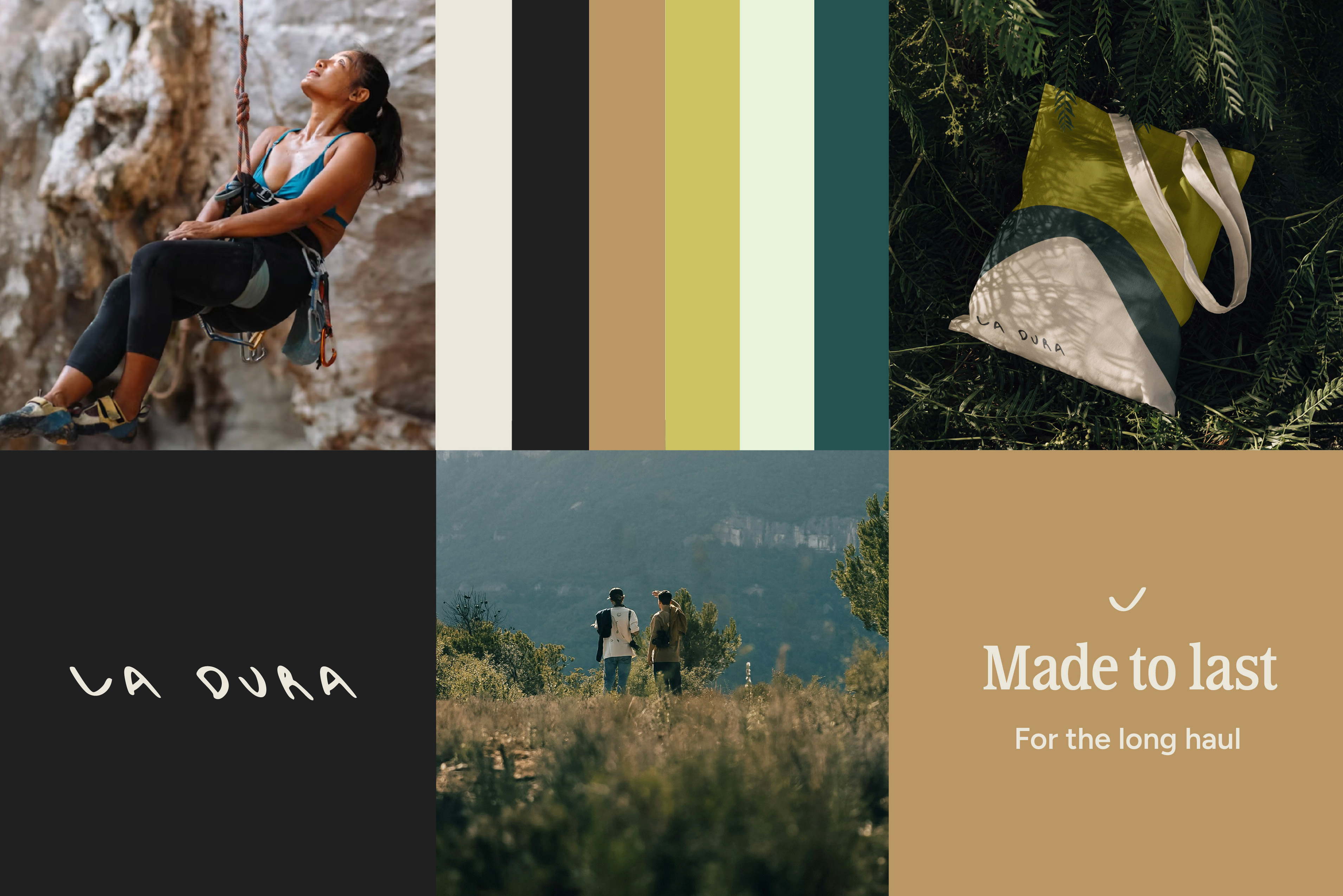
La Dura, meaning “The Hard Hard”, references one of the world’s most challenging climbs, forming the conceptual foundation for this sustainable outdoor gear startup.
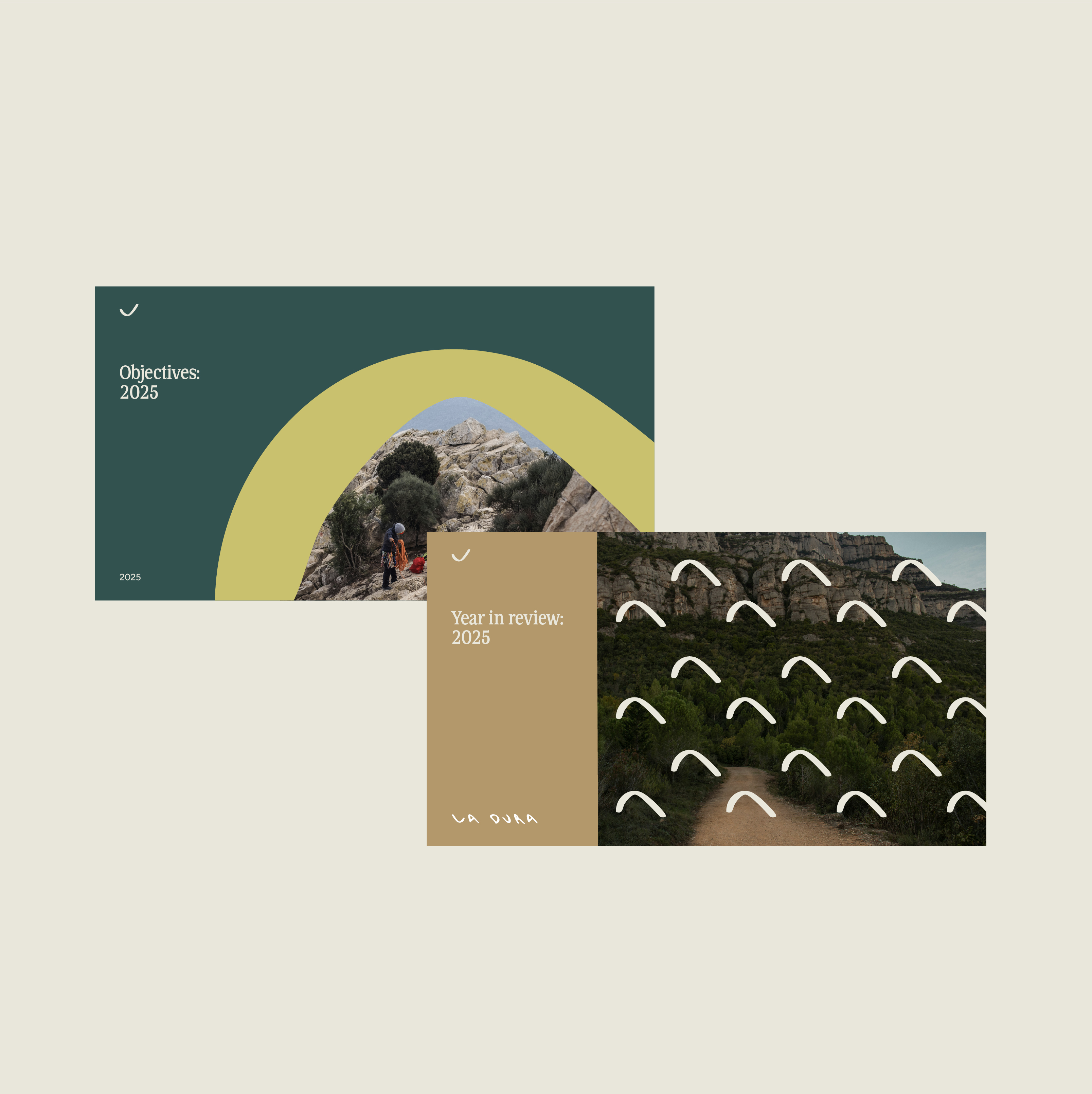
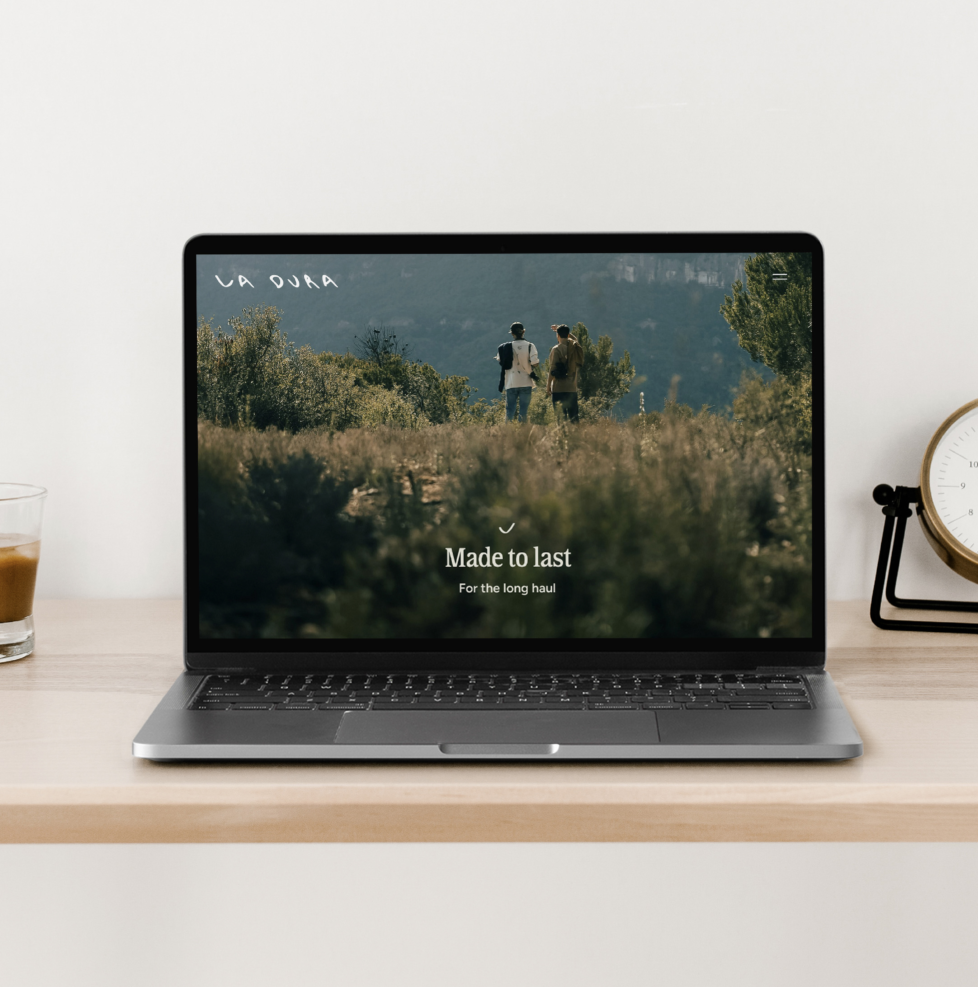
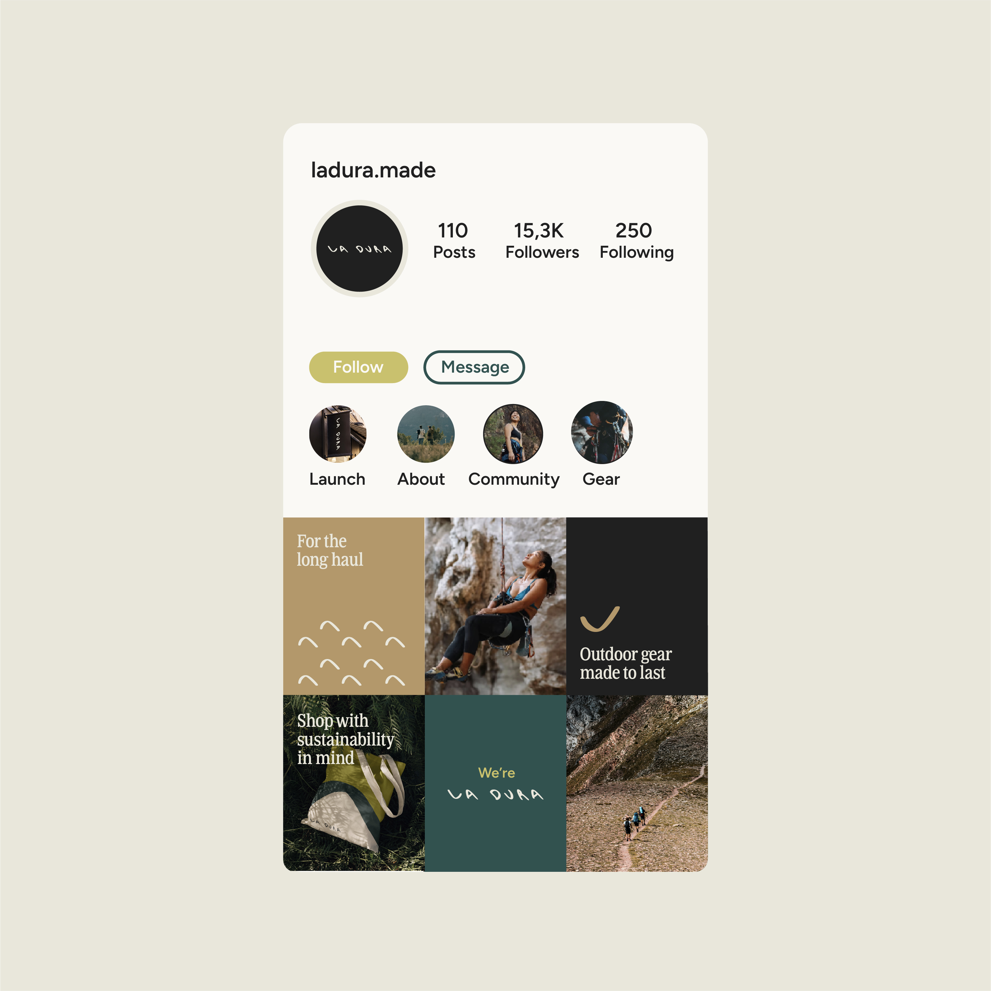
The project explored the development of a bold and expressive brand identity for an emerging climbing company focused on durability and environmental responsibility. The visual language drew inspiration from the tension between strength and sustainability, combining structured typography with an illustrative system rooted in movement and terrain.
project gallery
project video